Posts

Autoscopy

Image
      The autoscopy project turned out being a lot of fun to create. I like how we had to incorporate more than just two pictures into our work. I've recently watched a few shows that had to do with exploration and space so I took a lot of inspiration from those and wanted create something within that realm.     I chose a few images that would help me accomplish my goal. The background is a picture of a road within a forest used to show earth. I then replaced the sunny sky with a picture of the stars to show where I was heading to. After that I placed added a picture of myself. I stood in that position to try and emulate what a spaceship looks like. After, I used a picture of a rocket taking off to show the trusters at full power, blasting me into space. Lastly, I added a picture of code on a low opacity because going into space takes a lot of coding and calculations.  Overall, this project tested my abilities but I'm happy the way it turned out.  Original Pictures:

BW to Color

Image
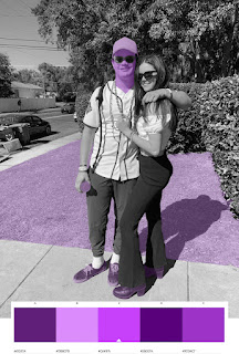
      This project was pretty difficult for me. I had to learn to navigate photoshop effectively by implementing tools just as copying layers and making new folders. I started out by embedding a photo of myself and then applying grayscale to it to make it black and white. I then went on adobe color and selected three different color swatches that I wanted to add into my image. I chose monochromatic, tried, and complimentary. I then had to decide which features into my photograph I wanted to enhance with color. I ended up picking my hat, gatorade, shirt, skin, shoes, and grass.      I enjoyed working on this project because it really put my photoshop skills to the test. It took a lot of patience using the quick selection tool because it would often select things I did not want colored. In the end, it was well worth all the time taken to complete this project. 

Business Cards

Image
    These are the three business cards I came up with. I had a really difficult time creating these because of placing the tag brush. I used simple colors because I did not want to take away or distract from my contact information places on the cards. I wanted to keep the business cards pretty basic because most of the cards I have gotten in the real world were pretty basic so I decided to stick with that methodology. On the cards I added my tag brush, name, number, email, and blog website.   

Photoshop HW1

https://www.youtube.com/watch?v=xFN4Hho4RNM      The most important thing to use in photoshop is using layers. It's important when you have multiple photos your adding on to each other to create an image. Another important thing is the clone tool, it allows you to copy a reference point and draws the exact pixels same pixels in a place of your choosing. It will help get rid of any imperfections in your work. I think the most difficult thing will be knowing when to adjust contours and saturation. I feel like having the eye to adjust those comes with practice and experience to know what looks good. https://www.youtube.com/watch?v=-M0LLrJVbQU     Masks can only be painted with black or white. Masks are using to basically punch a whole through the layer being masked. It removes what's seen in that specific layer. This is true for any layer you paint on. You can invert your masks from black to white and white to black using command+i. Something difficult I learned from this video is

Somewhere

Image
       Step Brothers is one of my all time favorite movies and debut of Prestige Worldwide has to be one of the funniest movie clips of all time. From boats n hoes to crashing their dads sailboat it’s a classic.   Using Adobe Illustrator I put myself in between Dale and Brennan in their performance of boats n hoes. It was a little tricky to color match the image of myself with the slightly blurry image of the scene that I could find off the internet.  I started by layering myself into the picture with my original image. I then added different hues and saturations to match myself to the colors of the scene. The hardest part of this project for me was having my pants cut off where the table is. I don't know why it was so difficult for me but I eventually figured it out. This was by far my favorite project we did because of the freedom we were given to pick any movie or show we wanted. Overall, I think this was the best project I created in class. Original Clip and Photo of Me:

Pre-Somewhere

Image
      I think that this image would be very difficult to recreate due to numerous factors. The being his being pulled, I'm not sure how you'd recreate that facial expression without having someone actually pulling on your face. The second factor is the shadows. I'm not sure how you could put your shadow on the back wall.      I took inspiration from this image being I like the notion of using movement. I feel like using an image that looks still would be pretty boring. It may be harder to recreate motion in my project however I think it would turn out better.       I thought this image was really funny because I think dabbing is cringy. It made me laugh when I saw it because once she noticed he was dabbing she dropped him. It reminded me of myself because I probably would have done the same thing.     I took inspiration from this image because I like the illusion of putting yourself in a place where you're clearly not but making it seem real. I'm going to use a very

Tag Brush

Image
      I really enjoyed manipulating my logo as a tag brush. It was my first time using photoshop which I had been pretty nervous about. The bottom image shows the original black and white tag brush. Again, I like the fact that we used previous work to build off of and create more work from. I used my black and white tag brush to create 3 different colored ones. I thought it was really fun stacking the tag bushes on top of each other with different colors to make it emulate being 3d or sticking out of the page. Adding the scratches and negatives to the logo was a really cool idea because now it looks like something that has been stuck on a wall, leaned up against, and rained on. It's no longer a perfect image. I also like how we are going to use the tag brush as our "signature" on future projects.